I’ve always been interested in the idea of information visualization–that there are better ways to present information than the simple ones we always use. In fact, I once wrote a university paper on things that were experimental at the time, like transparently overlaid GIS information, etc.
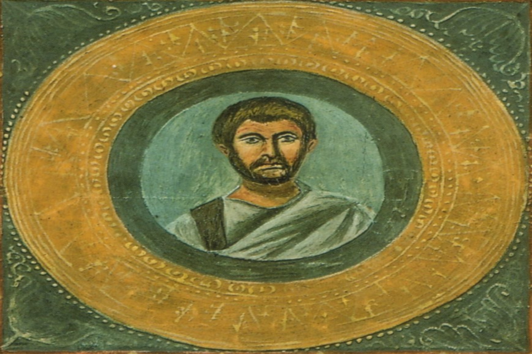
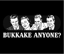
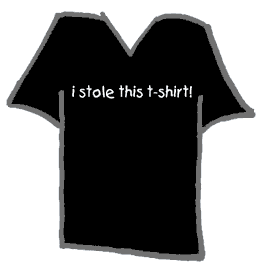
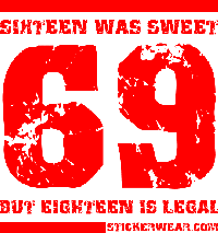
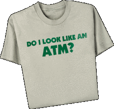
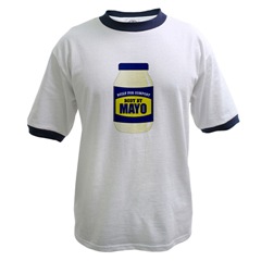
In this spirit, I present the eight other players in my weekly poker game, expressed visually as t-shirts. I won’t be associating the shirts with names, since either you know the people involved–in which case you need no names–or else you don’t know the people, so the names would be meaningless to you. A couple of these are crude, so consider this your chance to bail out of this post.




4 comments for “Understanding my weekly game”