When I finally gave in to Jobs and switched from my series of non-Apple mp3 players to the iPod I wanted to give mine some character. Ironically, one of the primary reasons I switched was all the third-party stuff that was available for the iPod, so it was easy to start looking into ways to “trick it out”.
My first attempt was to get myself one of the iFrogz component cases. I got a black case, with a “sunburst” band, and the radiation logo for the click wheel. It looked pretty cool, but ultimately it was unusable for me–primarily because the case obstructed access to the bottom port of the iPod, so to charge it or change the contents, I had to take it out. While the case was very thick, and likely would have protected the iPod from small arms fire, it also made the device substantially more bulky–this in turn interfered with the use of some of the third-party components, like docks, car holders, etc.
So, for my second attempt, I went with Gelaskins, selecting their Go Canada skin:
It’s essentially a set of easily removable printed vinyl decals that cover the front and back of the device, giving it character and protecting it from scratches, but without adding any bulk. The skins effectively don’t change the size of the device at all, which means all those third-party devices are fine for use with it. They also don’t block (or protect) the bottom port, meaning that they don’t affect use of docks, connection to the car, etc. They don’t provide the shock or weather protection of the iFrogz case, but if I need that I can just slip the iPod into the old case–the Gelaskins don’t impede sliding the iPod into the iFrogz case.
I’ve been pretty happy with the Gelaskin. In fact, I bought some other designs as gifts for some of my friends.
Now I’m thinking that I will order one of their skins for laptops–specifically one to jazz up my work laptop a bit, and give it some character. I have trip to Boston coming up, which would both make it easy to get the skin without dealing with international shipping and duty, and would also give me a chance to try it out on the people in the office.
The question is, which design do I want on my laptop.
I’ve narrowed it down to six possibles, and I’m going to pick one sometime Monday or Tuesday to order. I’ll show you what I’m thinking about, and why, and if you have any thoughts on the matter, drop a comment.
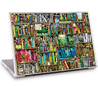
The first candidate is the Bookshelf design:
This might be a pretty obvious selection for me, given my tons of books and rooms full of shelving. But remember that my office is also my primary library, so there’s something appealing about my work laptop, which spends most of its days in the library being decked out like this.
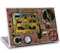
The second candidate is the Steampunk design:
I’ve been a fan of the steampunk aesthetic for a long time now–at least as far back as the original publications of The Difference Engine and Infernal Devices. Hell, I still enjoy it every other day in Girl Genius. So that’s the pro side. The con side is that the Indie Rock Pete inside of me says that steampunk is a little too common amongst the digerati these days–anything that’s common on BoingBoing can’t have indie cred!
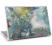
The third candidate is the Psychic Wars Design:
OK, this one has a lot going on, so looking at it offers a lot of possibilities for flights of fancy. It also tweaks the part of me that responds to Yes and Uriah Heap album covers. And the title hits that Blue Oyster Cult / Heavy Metal button. And none of that stuff is overly trendy at the moment, so it will quiet my internal IRP.
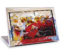
The fourth candidate is the Lizard Lounge design:
You can’t go wrong with Steadman, and the scene from Fear and Loathing that it refers to is maybe relevant to some of the places I’ll be taking this laptop. It also has the added benefit that it will unsettle some of my coworkers.
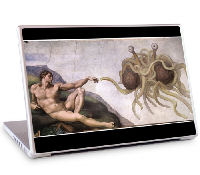
Candidate number five is a classic, the Touched By His Noodly Appendage design:
This one has the triple benefit of being based on a classic piece of art, of having a very strong philosophical underpinning, and of functioning as a conversation piece that will give me a chance to spread my poisonous atheism.
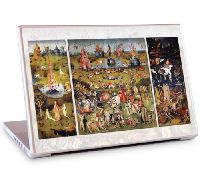
The final option is a whole different kind of class, the Garden Of Earthly Delights design:
Bosch‘s nightmarish fantasies have always had their appeal for me. And the religious basis appeals to me in an ironic way–that this was meant to illustrate moral lessons cracks me up. It might also provide an excuse to buy some of the figurines to go on my desk.
So… whadda ya think?



2 comments for “Adding Some Character”