One the great myths–in the sense of “stories we tell ourselves to understand the world”, not in the sense of “lie to be disproven”–of the Internet is how connectivity and open access to data enables all kinds of things to happen.
One of the great myths of science is that sharing data allows for the pool of knowledge to continue to grow–one of the few true commons that we still have.
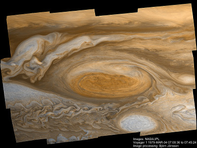
And that image you see above is a nice illustration of both of those myths. It a scaled down version of a new image of Jupiter’s Red Spot that was created by an Icelandic amateur, working from Voyager image data.
Yes, I said Voyager–images that have been available for 30+ years, and now that access to them is relatively easy, interested people can work with them and produce things like this image. An image which is arguably better than any we’ve ever had before.
The picture up top is a little 400px thumbnail that blows up to an 800px version, but the actual image is… rather larger.
Details are of the creation of the image, and some other related images, can be found at the Planetary Society blog.


